Tuesday, 21 December 2021
Brave
This is a Brave Rewards publisher verification file.
Domain: magicduetologic.blogspot.com
Token: 45eeee984ed00c32df9c8b1c5ac1f02e71ba827840b4b0c7e887f82fcd9d9faf
Sunday, 21 March 2021
Card with Hover Effect in HTML CSS
Card with Hover Effect in HTML CSS

Download : Code
index.html
<!DOCTYPE html>
<html lang="en" dir="ltr">
  <head>
    <meta charset="utf-8">
    <link rel="stylesheet" href="style.css" type="text/css">
    <title>Card with Hover Effect in HTML CSS</title>
  </head>
  <body>
    <div class="main center">
      <div class="card center">
        <p class="heading">Hello</p>
        <p class="text">Welcome to HTML CSS...!</p>
        <button class="btn">See More</button>
      </div>
    </div>
  </body>
</html>
Style.css
*{
  margin: 0;
  padding: 0;
}
body{
  background: black;
}
.center{
  display: flex;
  justify-content: center;
  align-items: center;
}
.main{
  width: 100%;
  height: 100vh;
}
.card{
  width: 350px;
  height: 400px;
  color: white;
  position: relative;
  flex-direction: column;
}
.card .heading{
  font-size: 3rem;
  transform: translateY(80px);
  transition: all .4s;
}
.card:hover .heading{
  transform: translateY(15px);
}
.card .text{
  font-size: 1.1rem;
  color: rgb(211,211,211);
  margin: 10px 30px;
  transform: translateY(50px);
  opacity: 0;
  transition: all .4s;
}
.card .btn{
  width: 150px;
  height: 40px;
  background: #240b36;
  border: none;
  margin: 10px;
  font-size: 1.1rem;
  color: rgb(219,219,219);
  cursor: pointer;
  transition: all .5s;
  transform: translateY(50px);
  outline: none;
  opacity: 0;
}
.btn:hover{
  background: #240b36c5;
}
.card:hover .text,.card:hover .btn{
  transform: translateY(20px);
  opacity: 1;
}
.card::after,
.card::before{
  content: '';
  position: absolute;
  top:0;
  left:0;
  width: 100%;
  height: 100%;
  z-index: -1;
}
.card::before{
  background: linear-gradient(to right, #240b36, #c31432);
}
.card::after{
  background: rgba(255, 255, 255, 0.082);
  filter: blur(10px);
  clip-path:polygon(25% 0%,100% 0%,75% 100%, 0% 100%);
  transition: all .5s;
}
.card:hover::after{
  clip-path:polygon(0 0%,100% 0%,100% 100%, 0 100%);
}
Download Code from Git
Download - Code
Saturday, 20 February 2021
Loading Animation using HTML CSS
Loading Animation using HTML CSS
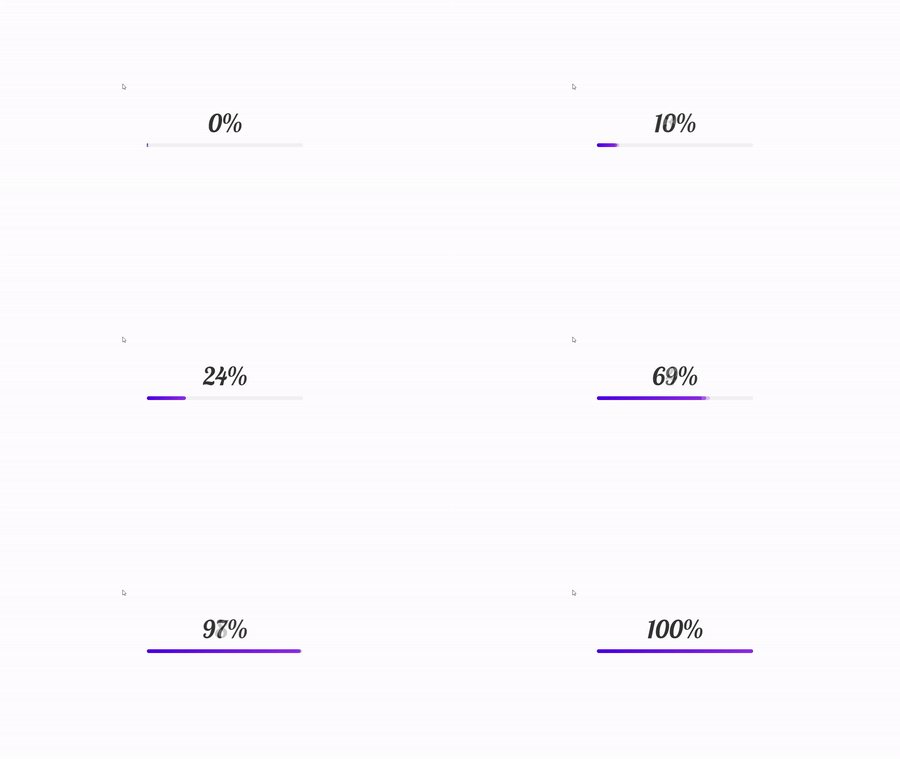
Download : Code
index.html
<!DOCTYPE html>
<html lang="en" dir="ltr">
  <head>
    <meta charset="utf-8">
    <link rel="stylesheet" href="style.css" type="text/css">
    <title>Loading Animation in HTML</title>
  </head>
  <body>
    <div class="main">
      <p class="text" id="text">0%</p>
      <div class="line" id="line">
      </div>
    </div>
    <script type="text/javascript">
      const op = setInterval(incNum, 20);
      function incNum() {
        const text = document.getElementById("text");
        const line = document.getElementById("line");

        let a = window.getComputedStyle(line,':before').getPropertyValue('width');
        a=Math.floor((parseInt(a)/10)*2);
        text.innerHTML = a + '%';
        console.log(a);
        if(a==100){
          clearInterval(op);
        }
      }
    </script>
  </body>
</html>
Style.css
@import url('https://fonts.googleapis.com/css2?family=Lobster&display=swap');
*{
  margin: 0;
  padding: 0;
}
.main{
  width: 100%;
  height: 100vh;
  display: flex;
  justify-content: center;
  align-items: center;
  flex-direction: column;
}
.line{
  width: 500px;
  height: 12px;
  background-color: rgb(243, 243, 243);
  border-radius: 50px;
  position: relative;
}
.line::before{
  content: '';
  position: absolute;
  top: 0;
  left: 0;
  width: 100%;
  height: 100%;
  background: #8E2DE2;
  border-radius: 50px;
  background: linear-gradient(to right, #4A00E0, #8E2DE2);
  animation: anim 2s;
}
@keyframes anim {
  0%{
    width: 0%;
  }
  20%{
    width: 5%;
  }
  50%{
    width: 25%;
  }
  60%{
    width: 35%;
  }
  100%{
    width: 100%;
  }
}
p{
  font-size: 5rem;
  font-family: 'Lobster',cursive;
  color: rgba(51, 51, 51);
  margin-bottom: 15px;
}
Thursday, 18 February 2021
Navigation Menu with Water Hover Effect
Navigation Menu with Water Hover Effect

Download : Code
index.html
<!DOCTYPE html>
<html lang="en" dir="ltr">
  <head>
    <meta charset="utf-8">
    <link rel="stylesheet" href="style.css" type="text/css">
    <title>Navigation Menu Water Effect Using HTML & CSS</title>
  </head>
  <body>
    <div class="menu">
      <a href="#">Home</a>
      <a href="#">Service</a>
      <a href="#">About</a>
      <a href="#">Contact Us</a>
    </div>
  </body>
</html>
Style.css
*{
  margin: 0;
  padding: 0;
  box-sizing: border-box;
}
body{
  height: 100vh;
  background: linear-gradient(to right,#3c1053,#ad5389);
}
.menu{
  position: absolute;
  top: 50%;
  left: 50%;
  transform: translate(-50%,-50%);
}
.menu a{
  color: rgb(233, 233, 233);
  text-decoration: none;
  font-size: 1.5rem;
  padding: 15px 30px;
  margin: 20px;
  background: rgba(255, 255, 255, 0.055);
  position: relative;
  transition: all .4s;
}
.menu a:hover{
  box-shadow: 0 20px 30px rgba(0, 0, 0, 0.24);
}
.menu a::before{
  content: '';
  position: absolute;
  bottom: 0;
  left: 0;
  width: 100%;
  height: 0%;
  background: #845ec2;
  z-index: -1;
  transition: all .4s;
}
.menu a:hover::before{
  height: 50%;
}
Tuesday, 12 January 2021
Water Animation Effect to Text using HTML CSS
Water Animation Effect to Text using HTML CSS

Download : Code
index.html
<!DOCTYPE html>
<html lang="en" dir="ltr">
  <head>
    <meta charset="utf-8">
    <link rel="stylesheet" href="style.css" type="text/css">
    <title>Water Animataion Effect Using HTML & CSS</title>
  </head>
  <body>
    <div class="loader">
      <h1>Water</h1>
    </div>
  </body>
</html>
Style.css
body{
  margin: 0;
  padding: 0;
  background: #262626;
  font-family: arial;
}
.loader{
  position: absolute;
  top: 50%;
  left: 50%;
  transform: translate(-50%,-50%);
}
.loader h1{
  margin: 0;
  padding: 0;
  text-transform: uppercase;
  font-size: 10em;
  color: rgba(255, 255, 255, 0.1);
  background-image: url(image.png);
  background-repeat: repeat-x;
  -webkit-background-clip: text;
  animation: animate 15s linear infinite;
}
@keyframes animate {

  0%{
    background-position: left 0px top 80px;
  }
  40%{
    background-position: left 800px top -50px;
  }
  80%{
    background-position: left 1800px top -50px;
  }
  100%{
    background-position: left 2400px top 80px;
  }
}
Cloud Animation Effect using HTML CSS
Cloud Animation Effect using HTML CSS

Download : Code
index.html
<!DOCTYPE html>
<html lang="en" dir="ltr">
  <head>
    <meta charset="utf-8">
    <link rel="stylesheet" href="style.css" type="text/css">
    <title>Cloud Animataion Effect Using HTML & CSS</title>
  </head>
  <body>
    <div class="container">
      <div class="Cloud1">
        <img src="cloud1.png" alt="">
      </div>
      <div class="Cloud2">
        <img src="cloud1.png" alt="">
      </div>
      <div class="Cloud3">
        <img src="cloud1.png" alt="">
      </div>
      <div class="Cloud4">
        <img src="cloud1.png" alt="">
      </div>

    </div>
  </body>
</html>
Style.css
body{
  margin: 0;
  padding: 0;
}
.container{
  background: url(image.jpg);
  background-size: cover;
  height: 100vh;
  width: 100%;
  position: relative;
  overflow: hidden;
}
.container img{
  width: 100%;
}
.container .Cloud1{
  position: absolute;
  top: 60px;
  animation: cloudOne infinite 30s linear;
}
.container .Cloud2{
  position: absolute;
  top: -50px;
  animation: cloudOne infinite 45s linear;
}
.container .Cloud3{
  position: absolute;
  top: 0px;
  animation: cloudOne infinite 15s linear;
}
.container .Cloud4{
  position: absolute;
  top: 0px;
  animation: cloudOne infinite 60s linear;
}
@keyframes cloudOne {
  0%{
    transform: translateX(-100%);
  }
  100%{
    transform: translateX(100%);
  }
}
@keyframes cloudTwo {
  0%{
    transform: translateX(-100%);
  }
  100%{
    transform: translateX(100%);
  }
}
@keyframes cloudThree {
  0%{
    transform: translateX(-100%);
  }
  100%{
    transform: translateX(100%);
  }
}
@keyframes cloudFour {
  0%{
    transform: translateX(-100%);
  }
  100%{
    transform: translateX(100%);
  }
}
Saturday, 9 January 2021
Card Using HTML & CSS
Card Using HTML & CSS

Download : Code
index.html
<!DOCTYPE html>
<html lang="en" dir="ltr">
  <head>
    <meta charset="utf-8">
    <link rel="stylesheet" href="style.css" type="text/css">
    <title>Card Using HTML & CSS</title>
  </head>
  <body>
    <div class="product">
      <div class="imagebox">
        <img src="image.png" alt="image">
      </div>
      <div class="specs">
        <h2>BRAND<br><span>NIKE</span></h2>
        <div class="price">$2000
        </div>
        <label>SIZE</label>
        <ul>
          <li>UK 6</li>
          <li>UK 7</li>
          <li>UK 8</li>
          <li>UK 9</li>
          <li>UK 10</li></ul>
          <label>COLOR</label>
          <ul class="color">
            <li></li>
            <li></li>
            <li></li>
            <li></li>
            <li></li></ul>
            <a href="#">ORDER NOW</a>
      </div>
    </div>
  </body>
</html>
style.css
*{
    padding: 0;
    margin: 0;
}
body{
  color: #fff;
  font-family: 'Segoe UI', Tahoma, Geneva, Verdana, sans-serif;
  background-color: #1E1F23;
}
.product{
  position: absolute;
  top: 50%;
  left: 50%;
  transform: translate(-50%, -50%);
  width: 300px;
  height: 400px;
  background-color: #FFF;
  border-radius: 5px;
  overflow: hidden;
}
.product .imagebox{
  height: 100%;
  box-sizing: border-box;
}
.product .imagebox img{
  display: block;
  width: 80%;
  margin: 10px auto 0;
}
.specs{
  position: absolute;
  width: 100%;
  bottom: -140px;
  background-color: #FFF;
  padding: 10px;
  box-sizing: border-box;
  color: #000;
  transition: .5s;
}
.specs:hover{
  bottom: 0;
}
.specs h2{
  font-size: 25px;
  width: 100%;
}
.specs h2 span{
  font-size: 18px;
  color: #808080;
  font-weight: normal;
}
.specs .price{
  position: absolute;
  top: 12px;
  right: 25px;
  font-weight: bold;
  font-size: 30px;
}
label{
  display: block;
  margin-top: 5px;
  font-weight: bold;
  font-size: 15px;
}
ul{
  display: flex;
}
ul li{
  width: 50px;
  height: 20px;
  list-style: none;
  margin: 5px 5px 0;
  font-size: 15px;
  color: #808080;
  text-align: center;
  cursor: pointer;
  transition: color 0.5s;
}
ul li:hover{
  color: #000;
}
ul li:first-child{
  margin-left: 0;
}
ul.color li{
  width: 50px;
  height: 20px;
}
ul.color li:nth-child(1){
  background-color: #FF0;
}
ul.color li:nth-child(2){
  background-color: #000;
}
ul.color li:nth-child(3){
  background-color: #F00;
}
ul.color li:nth-child(4){
  background-color: #00F;
}
ul.color li:nth-child(5){
  background-color: #F0F;
}
a{
  display: block;
  padding: 5px;
  color: #FFF;
  margin: 10px 0 0;
  background-color: #48a519;
  text-align: center;
  text-decoration: none;
  border-radius: 8px;
  cursor: pointer;
  transition: .2s;
}
a:hover{
  background-color: #5ebf31;
  color: #000;
}
Download Code from Git
Download - Code
Saturday, 2 January 2021
Navigation Bar with Hover Effect HTML CSS JS
Navigation Bar with Hover Effect HTML CSS JS

Download : Code
index.html
<!DOCTYPE html>
<html lang="en" dir="ltr">
  <head>
    <meta charset="utf-8">
    <link rel="stylesheet" href="style.css" type="text/css">
    <title>Navigation With Hover Effect</title>
  </head>
  <body>
  <div class="main">
    <div class="header">
      <input type="checkbox" id="btn">
      <a href="#">Menu</a>
      <a href="#">Products</a>
      <a href="#">About</a>
      <a href="#">Contact</a>
    </div>
  </div>
  <script type="text/javascript">
    const btn = document.querySelector("#btn");
    const header = document.querySelector(".header");
    btn.addEventListener("click",()=>{
      var htop = header.computedStyleMap().get('top').value;
      console.log(htop);
      if(htop=="-140"){
        header.style.top = "0px";
      }else{
        header.style.top = "-140px";
      }
    });
  </script>
  </body>
</html>
style.css
*{
    margin: 0;
    padding: 0;
}
body{
  background: black;
}
.header{
  margin: auto;
  width: 300px;
  height: 180px;
  background: rgb(10, 10, 10);
  position: relative;
  top: -140px;
  align-items: center;
  border-radius: 0 0 50px 50px;
  transition: all 0.5s;
}
.header::before,.header::after{
  content: '';
  position: absolute;
  top: 0;
  left: 0;
  width: 100%;
  height: 100%;
  border-radius: 0 0 50px 50px;
  background: linear-gradient(45deg,#ff0000,#00f0f0,#00ff00,#0000ff,#ff000069);
  z-index: -1;
  transform: scale(1.02);
  background-size: 500%;
  animation: anim 20s linear infinite;
}
@keyframes anim {
  0%, 100%{
    background-position: 0 0;
  }
  50%{
    background-position: 300% 0;
  }
}
.header::after{
  filter: blur(10px);
}
input{
  position: absolute;
  bottom: 10px;
  left: 50%;
  transform: translate(-50%);
  -webkit-appearance: none;
  outline: none;
  cursor: pointer;
}
input::before{
  content: '\f0c9';
  font-family: 'Font Awesome 5 Free';
  font-weight: 900;
  color: #f1f1f196;
}
a{
  margin: 20px;
  padding: 20px;
  color: rgb(95, 95, 95);
  position: absolute;
  font-weight: 700;
  font-family: cursive;
  text-decoration: none;
}
a:hover{
  color: #f1f1f196;
}
a:nth-child(3){
  left: 130px;
}
a:nth-child(5){
  top: 50px;
  left: 130px;
}
a:nth-child(4){
  top: 50px;
  left: 0px;
}
Download - Code
Friday, 25 December 2020
Custom Toggle Switch using CSS
Custom Toggle Switch using CSS

Download : Code
index.html
<!DOCTYPE html>
<html lang="en" dir="ltr">
  <head>
    <meta charset="utf-8">
    <link rel="stylesheet" href="style.css" type="text/css">
    <title>Custom Toggle Switch using CSS</title>
  </head>
  <body>
    <div class="box">
      <input type="checkbox" name="" id="">
      <div class="circle">

      </div>
    </div>
  </body>
</html>
style.css
*{
    margin: 0;
    padding: 0;
    box-sizing: border-box;
}
body{
  background: black;
}
.box{
  width: 120px;
  height: 60px;
  border: 4px solid #252525;
  border-radius: 50px;
  position: absolute;
  top: 50%;
  left: 50%;
  transform: translate(-50%,-50%);
}
input{
  position: absolute;
  width: 100%;
  height: 100%;
  cursor: pointer;
  outline: none;
  -webkit-appearance:none;
}
.circle{
  position: absolute;
  top:2px;
  left: 2px;
  width: 48%;
  height: 48px;
  background: rgb(48, 48, 48);
  border-radius: 50px;
  z-index: -1;
  transition: all .5s;
}
.circle::before{
  content: '';
  position: absolute;
  top: 50%;
  left: 50%;
  transform: translate(-50%,-50%);
  width: 10px;
  height: 10px;
  background: rgb(85, 85, 85);
  border-radius: 50px;
  transition: all 0.5s;
}
input:checked ~ .circle{
  transform: translateX(100%);
}
input:checked ~ .circle::before{
  background: #ffff00;
  box-shadow: 0 0 50px 3px #ffff00;
}
Download - Code
Tuesday, 22 December 2020
Custom Cursor Using HTML CSS & JS
Custom Cursor Using HTML CSS & JS

Download : Code
index.html
<!DOCTYPE html>
<html lang="en" dir="ltr">
  <head>
    <meta charset="utf-8">
    <link rel="stylesheet" href="style.css" type="text/css">
    <title>Custom Cursor</title>
  </head>
  <body>
    <div class="cursor">

    </div>
    <script type="text/javascript">
      const cursor=document.querySelector(".cursor");
      document.addEventListener("mousemove",e=>{
        cursor.setAttribute("style","top:"+e.pageY +"px;left:"+e.pageX +"px;")
      });
      document.addEventListener("click",()=>{
        cursor.classList.add("new");
        setTimeout(()=>{
          cursor.classList.remove("new");
        },500)
      })
    </script>
  </body>
</html>
style.css
*{
  margin: 0;
  padding: 0;
}
body{
  margin: 0;
  height: 100vh;
  background: black;
  cursor: none;
}
.cursor{
position: absolute;
width: 10px;
height: 10px;
border: 4px solid rgba(255, 255, 255,0.623);
border-radius: 50%;
}
.cursor::before{
  content: '';
  position: absolute;
  top: -1px;
  left: -1px;
  width: 10px;
  height: 10px;
  border: 1px solid rgba(255, 255, 255, 0.301);
  border-radius: 50%;
  animation: animl 0.5s linear infinite;
}
@keyframes animl {
  0%,100%{
    transform: scale(1);
  }
  50%{
    transform: scale(3);
  }
}
.new{
  animation: anim 0.5s forwards;
  border: 4px solid rgba(255, 0, 0, 0.692);
}
@keyframes anim {
  0%,100%{
    transform: scale(0);
  }
  50%{
    transform: scale(1.5);
  }
}
Download - Code
Saturday, 12 December 2020
Button With Hover Effect
Button With Hover Effect

Download : Code
index.html
<!DOCTYPE html>
<html lang="en" dir="ltr">
  <head>
    <meta charset="utf-8">
    <link rel="stylesheet" href="style.css" type="text/css">
    <title>Button With Hover Effect</title>
  </head>
  <body>
    <div class="main">
      <button class="btn">CLICK ME</button>
    </div>
  </body>
</html>
style.css
*{
  margin: 0;
  padding: 0;
}
.main{
  width: 100%;
  height: 100vh;
  display: flex;
  justify-content: center;
  align-items: center;
  background: black;
}
.btn{
  width: 200px;
  height: 60px;
  font-size: 1.0rem;
  font-family: 'Courier New', Courier, monospace;
  font-weight: 700;
  cursor: pointer;
  border: none;
  position: relative;
  color: white;
  z-index: 0;
  border: 1px solid #892cdc;
  background: black;
  overflow: hidden;
}
.btn:hover::before{
  top: 0px;
  border-radius: 0;
}
.btn::before{
  content: '';
  position: absolute;
  top: 60px;
  left: 0px;
  width: 100%;
  height: 100%;
  background: #892cdc;
  border-radius: 50% 50% 0% 0;
  z-index: -1;
  transition: all 0.5s;
}
*{
margin: 0;
padding: 0;
}
.main{
width: 100%;
height: 100vh;
display: flex;
justify-content: center;
align-items: center;
background: black;
}
.btn{
width: 200px;
height: 60px;
font-size: 1.0rem;
font-family: 'Courier New', Courier, monospace;
font-weight: 700;
cursor: pointer;
border: none;
position: relative;
color: white;
z-index: 0;
border: 1px solid #892cdc;
background: black;
overflow: hidden;
}
.btn:hover::before{
top: 0px;
border-radius: 0;
}
.btn::before{
content: '';
position: absolute;
top: 60px;
left: 0px;
width: 100%;
height: 100%;
background: #892cdc;
border-radius: 50% 50% 0% 0;
z-index: -1;
transition: all 0.5s;
}
Download - Code
Sunday, 6 December 2020
Rain Animation with Lighting Effect
Rain Animation with Lighting Effect

index.html
<!DOCTYPE html>
<html lang="en" dir="ltr">
  <head>
    <meta charset="utf-8">
    <link rel="stylesheet" href="style.css" type="text/css">
    <title>Rain Animation with Lighting Effect</title>
  </head>
  <body>
    <div class="rain">

    </div>
  </body>
</html>
style.css
body{
  margin: 0;
  padding: 0;
  background: url(background.jpg);
  background-size: cover;
  background-repeat: no-repeat;
}
.rain{
  height: 100vh;
  background: url(rain.png);
  animation: rain .5s linear infinite;
}
.rain::before{
  content: '';
  position: absolute;
  width: 100%;
  height: 100%;
  background: #fff;
  animation: lighting .3s linear infinite;
  opacity: 0;
}
@keyframes rain {
  0%{
    background-position: 0% 0%;
  }
  100%{
    background-position: 20% 100%;
  }
}
@keyframes lighting {
  0%{
    opacity: 0;
  }
  10%{
    opacity: 0;
  }
  11%{
    opacity: 1;
  }
  14%{
    opacity: 0;
  }
  20%{
    opacity: 0;
  }
  21%{
    opacity: 1;
  }
  24%{
    opacity: 0;
  }
  104%{
    opacity: 0;
  }
}Saturday, 21 November 2020
Pure CSS3 Background Pulse Animation Effect
Pure CSS3 Background Pulse Animation Effect

index.html
<!DOCTYPE html>
<html lang="en" dir="ltr">
  <head>
    <meta charset="utf-8">
    <link rel="stylesheet" href="style.css" type="text/css">
    <title>Pulse Effects</title>
  </head>
  <body>
    <section>
      <div class="bhPulse">
        <span></span>
        <span></span>
        <span></span>
        <span></span>
        <span></span>
        <span></span>
        <span></span>
        <span></span>
        <span></span>
        <span></span>
      </div>
    </section>
  </body>
</html>
style.css
body{
  margin: 0;
  padding: 0;
}
section{
  position: absolute;
  width: 100%;
  height: 100vh;
  overflow: hidden;
  animation: bgColor 20s linear infinite;
}
.bhPulse{
  width: 100%;
  height: 100%;
}
.bhPulse span{
  position: absolute;
  width: 80px;
  height: 80px;
  background: #fff;
  animation: animate 10s linear infinite;
}
@keyframes animate {
  0%{
    transform: scale(0) translateY(0) rotate(0deg);
    opacity: 1;
  }
  100%{
    transform: scale(1) translateY(-100px) rotate(360deg);
    opacity: 0;
  }
}
@keyframes bgColor {
    0%{
      background: #f44336;
    }
    25%{
      background: #03a9f4;
    }
    50%{
      background: #9c27b0;
    }
    75%{
      background: #f44336;
    }
    100%{
      background: #00ff0a;
    }
}

.bhPulse span:nth-child(1){
  top: 50%;
  left: 20%;
  animation: animate 10s linear infinite;
}
.bhPulse span:nth-child(3n+1){
background: transparent;
border: 5px solid #fff;
}
.bhPulse span:nth-child(2){
  top: 80%;
  left: 40%;
  animation: animate 12s linear infinite;
}
.bhPulse span:nth-child(3){
  top: 10%;
  left: 65%;
  animation: animate 15s linear infinite;
}
.bhPulse span:nth-child(4){
  top: 50%;
  left: 70%;
  animation: animate 6s linear infinite;
}
.bhPulse span:nth-child(5){
  top: 10%;
  left: 30%;
  animation: animate 9s linear infinite;
}
.bhPulse span:nth-child(6){
  top: 90%;
  left: 95%;
  animation: animate 8s linear infinite;
}
.bhPulse span:nth-child(7){
  top: 80%;
  left: 5%;
  animation: animate 5s linear infinite;
}
.bhPulse span:nth-child(8){
  top: 35%;
  left: 50%;
  animation: animate 14s linear infinite;
}
.bhPulse span:nth-child(9){
  top: 5%;
  left: 5%;
  animation: animate 11s linear infinite;
}
.bhPulse span:nth-child(10){
  top: 25%;
  left: 90%;
  animation: animate 10s linear infinite;
}
Friday, 13 November 2020
Drop shadow be a Gradient - CSS Animated Gradient Shadow Effects
Drop shadow be a Gradient - CSS Animated Gradient Shadow Effects

Download : Code
index.html
<!DOCTYPE html>
<html lang="en" dir="ltr">
  <head>
    <meta charset="utf-8">
    <link rel="stylesheet" href="style.css" type="text/css">
    <title>Animated Gradient Shadow Effects</title>
  </head>
  <body>
    <div class="shadow"></div>
  </body>
</html>
style.css
body{
  margin: 0;
  padding: 0;
  background: #000;
}
.shadow{
  position: relative;
  margin: 200px auto 0;
  width: 400px;
  height: 250px;
  background: linear-gradient(0deg,#000,#262626);
}
.shadow:before,
.shadow:after{
  content: '';
  position: absolute;
  left: -2px;
  top: -2px;
  background: linear-gradient(45deg, #fb0094,#0000ff, #00ff00,#ffff00,
    #ff0000,#fb0094,#0000ff, #00ff00,#ffff00, #ff0000);
  width: calc(100% + 4px);
  height: calc(100% + 4px);
  background-size: 400%;
  z-index: -1;
  animation: animate 20s linear infinite;
}

.shadow:after{
  filter: blur(20px);
}

@keyframes animate {

  0%{
    background-position: 0 0;
  }
  50%{
    background-position: 300% 0;
  }
  100%{
    background-position: 0 0;
  }
}
body{
margin: 0;
padding: 0;
background: #000;
}
.shadow{
position: relative;
margin: 200px auto 0;
width: 400px;
height: 250px;
background: linear-gradient(0deg,#000,#262626);
}
.shadow:before,
.shadow:after{
content: '';
position: absolute;
left: -2px;
top: -2px;
background: linear-gradient(45deg, #fb0094,#0000ff, #00ff00,#ffff00,
#ff0000,#fb0094,#0000ff, #00ff00,#ffff00, #ff0000);
width: calc(100% + 4px);
height: calc(100% + 4px);
background-size: 400%;
z-index: -1;
animation: animate 20s linear infinite;
}
.shadow:after{
filter: blur(20px);
}
@keyframes animate {
0%{
background-position: 0 0;
}
50%{
background-position: 300% 0;
}
100%{
background-position: 0 0;
}
}Download - Code
Monday, 9 November 2020
Quick SVG Elastic Line Animation Effect
Quick SVG Elastic Line Animation Effect

Download : Code
index.html
<!DOCTYPE html>
<html lang="en" dir="ltr">
  <head>
    <meta charset="utf-8">
    <link rel="stylesheet" href="style.css" type="text/css">
    <title>Quick SVG Elastic Line Animation Effect</title>
  </head>
  <body>
    <svg>
      <path></path>
    </svg>
    <svg>
      <path></path>
    </svg>
  </body>
</html>
style.css
*{
  margin: 0;
  padding: 0;
}
body{
  display: flex;
  justify-content: center;
  align-items: center;
  min-height: 100vh;
  background: #000;
}
svg{
  position: absolute;
  width: 400px;
  fill: none;
}
svg:nth-child(2){
  filter: blur(40px);
}
svg path{
  d: path("M0,25 C150,110 150,-60 300,25");
  stroke: #ff0092;
  stroke-width: 50;
  stroke-linecap: round;
  transform: translate(50px, 50%);
  animation: animate 2s ease-in-out infinite;
}
@keyframes animate {
  0%{
    stroke: #ff0092;
    d: path("M0,25 C150,110 150,-60 300,25");
  }
  50%{
    stroke: #00ff00;
    d: path("M0,25 C160,-50 140,110 300,25");
  }
}
Download - Code
Sunday, 8 November 2020
Animated Eyes Follow Mouse Cursor
Animated Eyes Follow Mouse Cursor

Download : Code
Index.html
<!DOCTYPE html>
<html lang="en" dir="ltr">
  <head>
    <meta charset="utf-8">
    <link rel="stylesheet" href="style.css" type="text/css">
    <title>Eyes Follow Mouse Cursor</title>
  </head>
  <body>
    <div class="face">
      <div class="eyes">
        <div class="eye"></div>
        <div class="eye"></div>
        </div>
      </div>
      <script>
        document.querySelector('body').addEventListener('mousemove',eyeball);
        function eyeball(){
          var eye = document.querySelectorAll('.eye');
          eye.forEach(function(eye){
            let x = (eye.getBoundingClientRect().left) + (eye.clientWidth / 2);
            let y = (eye.getBoundingClientRect().top) + (eye.clientHeight / 2);

            let radian = Math.atan2(event.pageX - x, event.pageY - y);
            let rot = (radian * (180 / Math.PI)* - 1) + 0;
            eye.style.transform = "rotate("+rot+"deg)";
          })
        }
      </script>
  </body>
</html>
style.css
*{
  margin: 0;
  padding: 0;
  box-sizing: border-box;
}
body{
  display: flex;
  justify-content: center;
  align-items: center;
  min-height: 100vh;
  background: #000;
}
.face{
  position: relative;
  width: 300px;
  height: 300px;
  border-radius: 50%;
  background: #ffcd00;
  display: flex;
  justify-content: center;
  align-items: center;
}
.face::before{
  content: '';
  position: absolute;
  top: 180px;
  width: 150px;
  height: 70px;
  background: #b57700;
  border-bottom-left-radius: 70px;
  border-bottom-right-radius: 70px;
  transition: 0.5s;
}
.face:hover::before{
  top: 210px;
  width: 150px;
  height: 20px;
  background: #b57700;
  border-bottom-left-radius: 0px;
  border-bottom-right-radius: 0px;
}
.eyes{
  position: relative;
  top: -40px;
  display: flex;
}
.eyes .eye{
  position: relative;
  width: 80px;
  height: 80px;
  display: block;
  background: #fff;
  margin: 0 15px;
  border-radius: 50%;
}
.eyes .eye::before{
  content: '';
  position: absolute;
  top: 50%;
  left: 25px;
  transform: translate(-50%,-50%);
  width: 40px;
  height: 40px;
  background: #333;
  border-radius: 50%;
}
Download - Code
Sunday, 25 October 2020
3D Wavy Circle Loader Animation Effect
3D Wavy Circle Loader Animation Effect HTML CSS

Download : Code
Index.html
<!DOCTYPE html>
<html lang="en" dir="ltr">
  <head>
    <meta charset="utf-8">
    <link rel="stylesheet" href="style.css" type="text/css">
    <title>3D Wavy Circle Loader Animation Effect</title>
  </head>
  <body>
    <div class="loader">
      <span></span>
      <span></span>
      <span></span>
      <span></span>
      <span></span>
      <span></span>
      <span></span>
      <span></span>
      <span></span>
      <span></span>
      <span></span>
      <span></span>
      <span></span>
      <span></span>
      <span></span>
    </div>
  </body>
</html>
style.css
*{
  margin: 0;
  padding: 0;
}
body{
  display: flex;
  justify-content: center;
  align-items: center;
  min-height: 100vh;
  background: #000;
}
.loader{
  position: relative;
  width: 300px;
  height: 300px;
  transform-style: preserve-3d;
  transform: perspective(500px) rotateX(60deg);
}
.loader span{
  position: absolute;
  display: block;
  border: 5px solid #fff;
  box-shadow: 0 5px 0 #ccc;
              inset 0 5px 0 #ccc;
  box-sizing: border-box;
  border-radius: 50%;
  animation: animate 3s ease-in-out infinite;
}
@keyframes animate {
  0%,100%{
    transform: translateZ(-100px);
  }
  50%{
    transform: translateZ(100px);
  }
}
.loader span:nth-child(1){
  top: 0px;
  left: 0px;
  bottom: 0px;
  right: 0px;
  animation-delay: 1.4s;
}
.loader span:nth-child(2){
  top: 10px;
  left: 10px;
  bottom: 10px;
  right: 10px;
  animation-delay: 1.3s;
}
.loader span:nth-child(3){
  top: 20px;
  left: 20px;
  bottom: 20px;
  right: 20px;
  animation-delay: 1.2s;
}
.loader span:nth-child(4){
  top: 30px;
  left: 30px;
  bottom: 30px;
  right: 30px;
  animation-delay: 1.1s;
}
.loader span:nth-child(5){
  top: 40px;
  left: 40px;
  bottom: 40px;
  right: 40px;
  animation-delay: 1.0s;
}
.loader span:nth-child(6){
  top: 50px;
  left: 50px;
  bottom:50px;
  right: 50px;
  animation-delay: 0.9s;
}
.loader span:nth-child(7){
  top: 60px;
  left: 60px;
  bottom: 60px;
  right: 60px;
  animation-delay: 0.8s;
}
.loader span:nth-child(8){
  top: 70px;
  left: 70px;
  bottom: 70px;
  right: 70px;
  animation-delay: 0.7s;
}
.loader span:nth-child(9){
  top: 80px;
  left: 80px;
  bottom: 80px;
  right: 80px;
  animation-delay: 0.6s;
}
.loader span:nth-child(10){
  top: 90px;
  left: 90px;
  bottom: 90px;
  right: 90px;
  animation-delay: 0.5s;
}
.loader span:nth-child(11){
  top: 100px;
  left: 100px;
  bottom: 100px;
  right: 100px;
  animation-delay: 0.4s;
}
.loader span:nth-child(12){
  top: 110px;
  left: 110px;
  bottom: 110px;
  right: 110px;
  animation-delay: 0.3s;
}
.loader span:nth-child(13){
  top: 120px;
  left: 120px;
  bottom: 120px;
  right: 120px;
  animation-delay: 0.2s;
}
.loader span:nth-child(14){
  top: 130px;
  left: 130px;
  bottom: 130px;
  right: 130px;
  animation-delay: 0.1s;
}
.loader span:nth-child(15){
  top: 140px;
  left: 140px;
  bottom: 140px;
  right: 140px;
  animation-delay: 0s;
}
Download - Code
Neon Light Button Animation Effect on Hover | HTML CSS
Neon Light Button Animation Effect on Hover in HTML CSS

Download: Code
Index.html
<!DOCTYPE html>
<html lang="en" dir="ltr">
  <head>
    <meta charset="utf-8">
    <link rel="stylesheet" href="style.css" type="text/css">
    <title>Neon Light Button Hover Effect</title>
  </head>
  <body>
    <a href="#">
      <span></span>
      <span></span>
      <span></span>
      <span></span>
      Neon button
      </a>
     <a href="#">
        <span></span>
        <span></span>
        <span></span>
        <span></span>
        Neon button
      </a>
      <a href="#">
         <span></span>
         <span></span>
         <span></span>
         <span></span>
         Neon button
       </a>
  </body>
</html>
style.css
*{
  margin: 0;
  padding: 0;
  font-family: consolas;
  box-sizing: border-box;
}
body{
  display: flex;
  justify-content: center;
  align-items: center;
  min-height: 100vh;
  flex-direction: column;
  background: #000;
}
a{
  position: relative;
  display: inline-block;
  padding: 25px 30px;
  margin: 40px 0;
  color: #03e9f4;
  font-size: 24px;
  text-decoration: none;
  text-transform: uppercase;
  Overflow: hidden;
  transition: 0.5s;
  letter-spacing: 4px;
  -webkit-box-reflect: below 1px linear-gradient(transparent,#0005);
}
a:nth-child(1){
  filter: hue-rotate(290deg);
}
a:nth-child(3){
  filter: hue-rotate(110deg);
}
a:hover{
  background: #03e9f4;
  color: #000;
  box-shadow: 0 0 5px #03e9f4,
              0 0 25px #03e9f4,
              0 0 50px #03e9f4,
              0 0 200px #03e9f4;
}
a span{
  position: absolute;
  display: block;
}
a span:nth-child(1){
  top: 0;
  left: -100;
  width: 100%;
  height: 2px;
  background: linear-gradient(90deg,transparent,#03e9f4);
  animation: animate1 1s linear infinite;
}
@keyframes  animate1{
  0%{
      left: -100%;
  }
  50%,100%{
      left: 100%;
  }
}
a span:nth-child(2){
  top: -100%;
  right: 0;
  width: 2px;
  height: 100%;
  background: linear-gradient(180deg,transparent,#03e9f4);
  animation: animate2 2s linear infinite;
  animation-delay: 0.25s;
}
@keyframes  animate2{
  0%{
      top: -100%;
  }
  50%,100%{
      top: 100%;
  }
}
a span:nth-child(3){
  bottom: 0;
  right: -100%;
  width: 100%;
  height: 2px;
  background: linear-gradient(270deg,transparent,#03e9f4);
  animation: animate3 1s linear infinite;
  animation-delay: 0.5s;
}
@keyframes  animate3{
  0%{
      right: -100%;
  }
  50%,100%{
      right: 100%;
  }
}
a span:nth-child(4){
  bottom: -100%;
  left: 0;
  width: 2px;
  height: 100%;
  background: linear-gradient(360deg,transparent,#03e9f4);
  animation: animate4 1s linear infinite;
  animation-delay: 0.75s;
}
@keyframes  animate4{
  0%{
      bottom: -100%;
  }
  50%,100%{
      bottom: 100%;
  }
}
Download - Code
Monday, 31 August 2020
Flower Rain Animation in HTML CSS
Flower Rain Animation in HTML CSS -
Download: Code
Index.html
<!DOCTYPE html>
<html>
  <head>
    <link rel="stylesheet" type="text/css" href="style.css">
    <title>Flower Animaion</title>
  </head>
  <body>
    <div class="canvas">

     <div class="flower" id="flower1">
        <div class="petal petal1 f1p"></div>
        <div class="petal petal2 f1p"></div>
        <div class="petal petal3 f1p"></div>
        <div class="petal petal4 f1p"></div>
        <div class="petal petal5 f1p"></div>
     </div>

     <div class="flower" id="flower2">
        <div class="petal petal1 f2p"></div>
        <div class="petal petal2 f2p"></div>
        <div class="petal petal3 f2p"></div>
        <div class="petal petal4 f2p"></div>
        <div class="petal petal5 f2p"></div>
     </div>

     <div class="flower" id="flower3">
        <div class="petal petal1 f3p"></div>
        <div class="petal petal2 f3p"></div>
        <div class="petal petal3 f3p"></div>
        <div class="petal petal4 f3p"></div>
        <div class="petal petal5 f3p"></div>
     </div>

     <div class="flower" id="flower4">
        <div class="petal petal1 f4p"></div>
        <div class="petal petal2 f4p"></div>
        <div class="petal petal3 f4p"></div>
        <div class="petal petal4 f4p"></div>
        <div class="petal petal5 f4p"></div>
     </div>

     <div class="flower" id="flower5">
        <div class="petal petal1 f5p"></div>
        <div class="petal petal2 f5p"></div>
        <div class="petal petal3 f5p"></div>
        <div class="petal petal4 f5p"></div>
        <div class="petal petal5 f5p"></div>
     </div>

     <div class="flower" id="flower6">
        <div class="petal petal1 f6p"></div>
        <div class="petal petal2 f6p"></div>
        <div class="petal petal3 f6p"></div>
        <div class="petal petal4 f6p"></div>
        <div class="petal petal5 f6p"></div>
     </div>
  </div>
  </body>
</html>
style.css
body {
    margin:0;
    padding:0;
    background-color:#702050;
}
.canvas{
    display:inline;
}
.flower{
    width:15px;
    height:15px;
    border-radius:50%;
    z-index:1;
    position:absolute;
    top:-20%;
}
.petal{
    width:15px;
    height:15px;
    border-radius:50%;
    z-index:-1;
}
.petal1{
    position:relative;
    left:-70%; top:20%;
}
.petal2{
    position:relative;
    top:-18%; left:-5%;
}
.petal3{
    position:relative;
    top:-170%; left:72%;
}
.petal4{
    position:relative;
    top:-363%; left:-30%;
}
.petal5{
    position:relative;
    top:-450%; left:53%;
}

#flower1{
    background-color:yellow;
    position:absolute;
    left:8%;
    animation-name:rain;
    animation-duration:7s;
    animation-iteration-count:infinite;
    animation-timing-function:linear;
}
.f1p{
    background-color:pink;
}

#flower2{
    background-color:orange;
    position:absolute;
    left:25%;
    animation-name:rain;
    animation-duration:4s;
    animation-iteration-count:infinite;
    animation-timing-function:linear;
    animation-delay:1.5s;
}
.f2p{
    background-color:yellow;
}
#flower3{
    background-color:red;
    position:absolute;
    left:42%;
    animation-name:rain;
    animation-duration:10s;
    animation-iteration-count:infinite;
    animation-timing-function:linear;
    animation-delay:0s;
}
.f3p{
    background-color:skyblue;
}
#flower4{
    background-color:cyan;
    position:absolute;
    left:59%;
    animation-name:rain;
    animation-duration:2.5s;
    animation-iteration-count:infinite;
    animation-timing-function:linear;
    animation-delay:2.5s;
}
.f4p{
    background-color:blue;
}

#flower5{
    background-color:green;
    position:absolute;
    left:75%;
    animation-name:rain;
    animation-duration:10s;
    animation-iteration-count:infinite;
    animation-timing-function:ease-out;
    animation-delay:3s;
}
.f5p{
    background-color:lightgreen;
}

#flower6{
    background-color:magenta;
    position:absolute;
    left:90%;
    animation-name:rain;
    animation-duration:2s;
    animation-iteration-count:infinite;
    animation-timing-function:ease-in;
    animation-delay:4.5s;
}
.f6p{
    background-color:turquoise;
}
@keyframes rain{
    0%{transform:rotate(0deg);
       top:-10%;
    }
    100%{transform:rotate(720deg);
         top:100vh;
    }
}
Output -

Source Code - Click Here...
Subscribe to:
Posts (Atom)