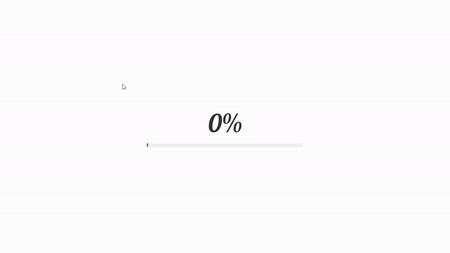
Loading Animation using HTML CSS
Download : Code
index.html
<!DOCTYPE html>
<html lang="en" dir="ltr">
  <head>
    <meta charset="utf-8">
    <link rel="stylesheet" href="style.css" type="text/css">
    <title>Loading Animation in HTML</title>
  </head>
  <body>
    <div class="main">
      <p class="text" id="text">0%</p>
      <div class="line" id="line">
      </div>
    </div>
    <script type="text/javascript">
      const op = setInterval(incNum, 20);
      function incNum() {
        const text = document.getElementById("text");
        const line = document.getElementById("line");

        let a = window.getComputedStyle(line,':before').getPropertyValue('width');
        a=Math.floor((parseInt(a)/10)*2);
        text.innerHTML = a + '%';
        console.log(a);
        if(a==100){
          clearInterval(op);
        }
      }
    </script>
  </body>
</html>
Style.css
@import url('https://fonts.googleapis.com/css2?family=Lobster&display=swap');
*{
  margin: 0;
  padding: 0;
}
.main{
  width: 100%;
  height: 100vh;
  display: flex;
  justify-content: center;
  align-items: center;
  flex-direction: column;
}
.line{
  width: 500px;
  height: 12px;
  background-color: rgb(243, 243, 243);
  border-radius: 50px;
  position: relative;
}
.line::before{
  content: '';
  position: absolute;
  top: 0;
  left: 0;
  width: 100%;
  height: 100%;
  background: #8E2DE2;
  border-radius: 50px;
  background: linear-gradient(to right, #4A00E0, #8E2DE2);
  animation: anim 2s;
}
@keyframes anim {
  0%{
    width: 0%;
  }
  20%{
    width: 5%;
  }
  50%{
    width: 25%;
  }
  60%{
    width: 35%;
  }
  100%{
    width: 100%;
  }
}
p{
  font-size: 5rem;
  font-family: 'Lobster',cursive;
  color: rgba(51, 51, 51);
  margin-bottom: 15px;
}
